This article is updated for version 1.01 - later versions of Moments might differ slightly.
Moments Designer has two sections: the Album Preview/Manager and the Album Page/Spread Editor. The Album Preview/Manager adds, removes and reorderes photo album pages. Design pages using the Album Page/Spread Editor following the steps in this tutorial.
Moments Designer has two sections: the Album Preview/Manager and the Album Page/Spread Editor. The Album Preview/Manager adds, removes and reorderes photo album pages. Design pages using the Album Page/Spread Editor following the steps in this tutorial.
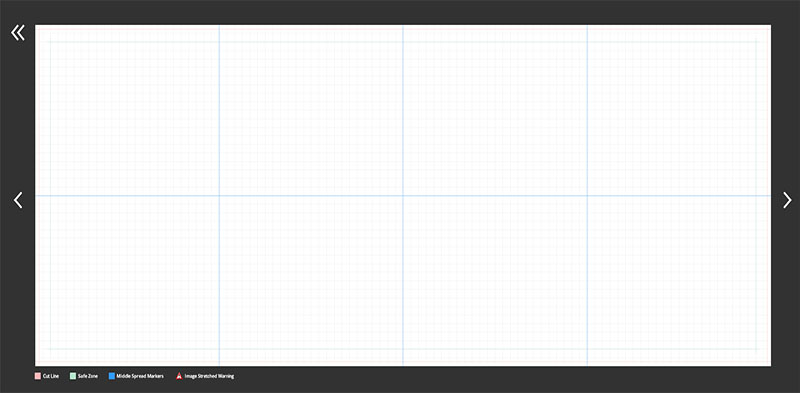
When clicking on a page on the album preview/manager section you enter the page preview/editor. If the spread is empty, you will be presented with an empty canvas, with various guides drawn on top of it.
The red lines are the cut lines, the green lines indicate the safe zone and the blue ones are just page middles.
Everything beyond the red cut lines have a high probability to be trimmed in fabrication. Everything inside the green rectangle, inside the safe zone are safe from cutting, as a rule, you should place everything important inside the green zone.
Everything beyond the red cut lines have a high probability to be trimmed in fabrication. Everything inside the green rectangle, inside the safe zone are safe from cutting, as a rule, you should place everything important inside the green zone.

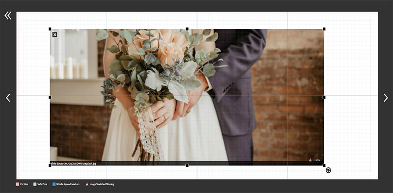
Once you have populated the image library you can start the design process. Add images from the library to you page with drag and drop. This will place the image inside a design element we will be calling from now on
an image container. Click on the image you placed to reveal it.

The container surrounds the image/images. The eight squares at corners and middles are used to resize and position the element in page. Drag any of them with the mouse and position the container anywhere on page. The images inside will
resize and rearrange themselves as you do so.
You can place multiple images inside, they will arrange themselves inside depending on the settings of the container. When dragging another image from the library and hovering over the container, markings will highlight the positions where you can drop the image. Drop it on any of them to complete the action. Below, you can see different markings at various positions:
You can place multiple images inside, they will arrange themselves inside depending on the settings of the container. When dragging another image from the library and hovering over the container, markings will highlight the positions where you can drop the image. Drop it on any of them to complete the action. Below, you can see different markings at various positions:

Because the page uses a layering system, sometimes elements overlap, some are behind others and will be hard to edit. By double-clicking on any element, it will be brought to front temporary, just for editing purposes.
When selecting another or clicking somewhere outside the canvas, the element will return to its original position.
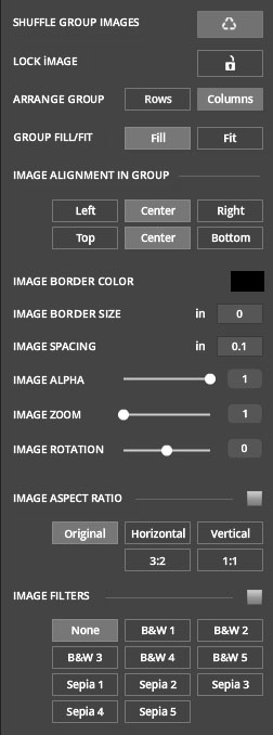
The control panel on the left side of the app has tools for managing the content selected or inside the 'image container'. You can change the alignment, image spacing, add borders around photos, apply filters or by pressing the last "X" button, delete the element from page.
The control panel on the left side of the app has tools for managing the content selected or inside the 'image container'. You can change the alignment, image spacing, add borders around photos, apply filters or by pressing the last "X" button, delete the element from page.

- The first button shuffles arround the photos inside the 'container'
- Locked and unlocked button is used to restrict the container from accepting any more images, when in locked possition. When dragging and image from library over a locked container, the image is not added inside. Instead, a new container element is created. This behaviour is usefull whne creating an image background. Make the container locked, set it to far back and work on top of it. When locked, you can still change possition, apply effects, change arrangement, the locked state is related only to accepting or in this case not accepting any more images.
- Next buttons controls how images are arranges inside the container. You can choose to place them in lines or in a culumn arrangement.
- Next controls expands the images to the entire area of the container if Fill is selected or try to keep the aspect ratio of each image, as selected by the previous button, but in this case the image group will use only a portion of the area allocated by the container.
- Align the content inside with the next two options. You can control the horizontal position by choosing: Left, Center or Right options. Top, Center and Bottom are the options for the second button that controls the vertical alignment. Try playing with them to understand it better. Make sure you select the "Fitt" option to see any changes. As opposed to "Fitt", the "Fill" option overwrites many of these settings when trying to enlarge the content to full area.
Next controls act on the image selected, adding borders and setting the border color and size, image opacity, zoom and rotation.
- Aspect ratio of the photos are set by next control group. When the checkmark is selected, change the aspect ratio of all photos inside the container. When it's unchecked, you operate only on the selected photo. Your options are: Original, Horizontal, Vertical, 1:1, 3:2.
- Effects button is next. Apply image effects/filters to the images inside the container. You have, for now, just Black and White and Sepia filters. More to come.
On the top you have a few more options:
RANDOM LAYOUT takes a random template and apply it onto spread. SET LAYOUT opens the template gallery and lets you choose what template you like to use.
To save you custom page design for later use or other albums, you can save it as a template. Do that by pressing the SAVE AS TEMPLATE button.
AUTO DESIGN on far left is a toggle button, when active, it has a white band on the bottom. When it's active, when dragging and dropping images from the library they are auto arranged inside the page. In this way you can create your spreads in record time.
At the center, you have a group with seven buttons:
- first two are undo and redo buttons
- the third button adds a text element
- the fourth, changes the background color of the canvas
- next two buttons deal with the layering system of the page. The first of the two, brings the selected element one layer to the top while the other moves the selected element one layer to the bottom.
- the last button, when pressed, displays six more positioning buttons. They arrange an element inside the page. You can position it on (from left to right) left side, horizontal center, right side, top, vertical center and the last on the bottom side. By default, they are placed relative to the page borders. By ticking the RELATIVE TO SAFE_ZONE checkbox, as the name says, they will be arranged relative to the safe zone.
Designing your album pages is a straightforward process, only your imagination is the limit. When you're all done and each spread meets your stringent requirements you're ready for the next step! Learn about Moments export options, settings and overall process.
Moments Designer is a full featured digital album designer for both professional and amateur photographers, with a clean, without extraneous distractions, drag and drop layout.